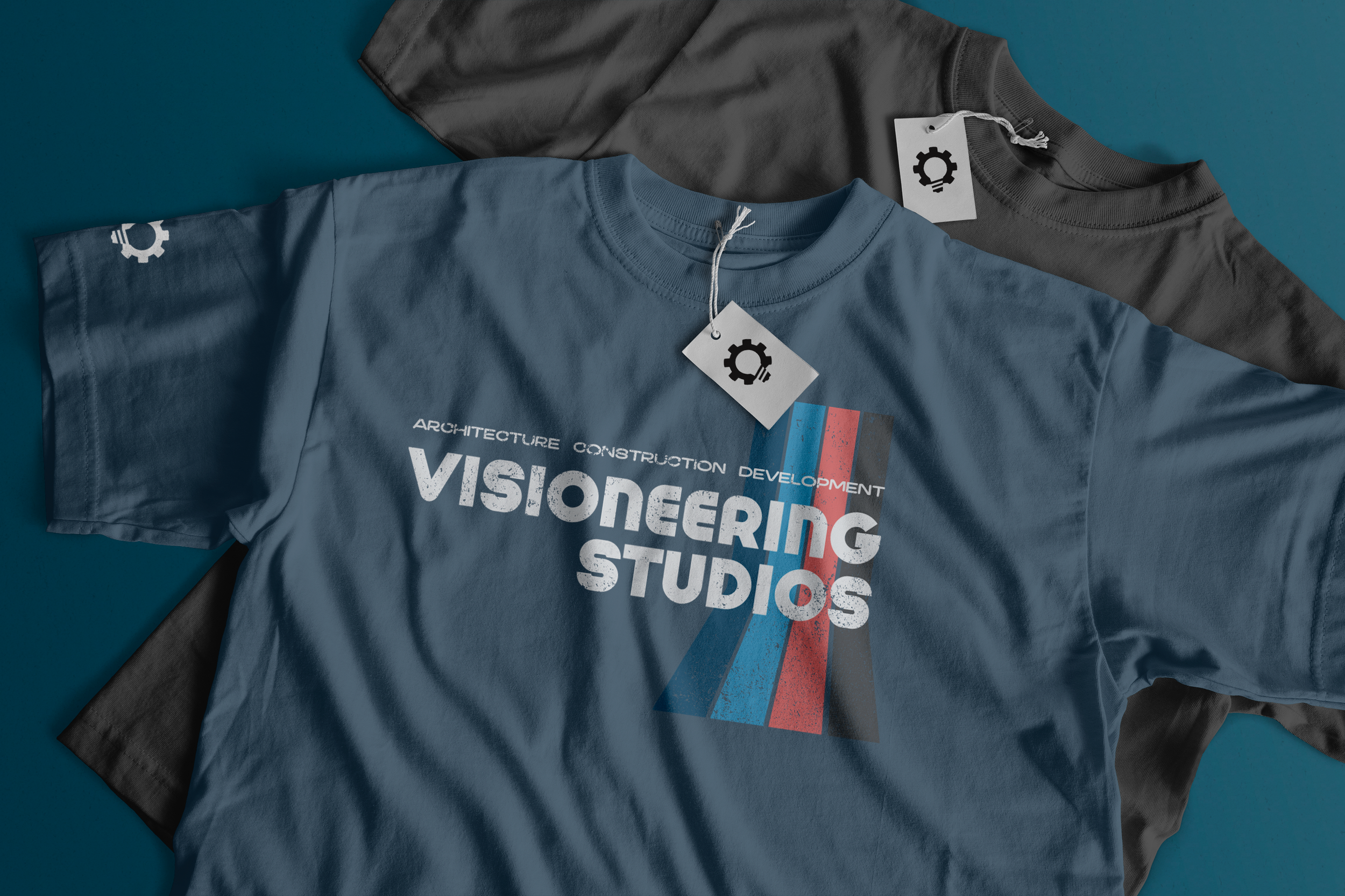
Integrated Marketing Materials
Visioneering Studios is a national architecture and construction firm that partners with churches, organizations, and businesses across the country to create spaces that support growth, community, and long-term impact. With offices in Santa Ana, Dallas and Nashville, our team serves clients nationwide through integrated design and construction services.
As Visioneering’s lead designer, I create a wide range of marketing and brand materials that support business development, client engagement, recruiting, and company initiatives. From portfolio books and construction brochures to annual reports, conference materials, and branded apparel, each piece is designed to strengthen brand consistency while communicating complex information in a clear and engaging way.
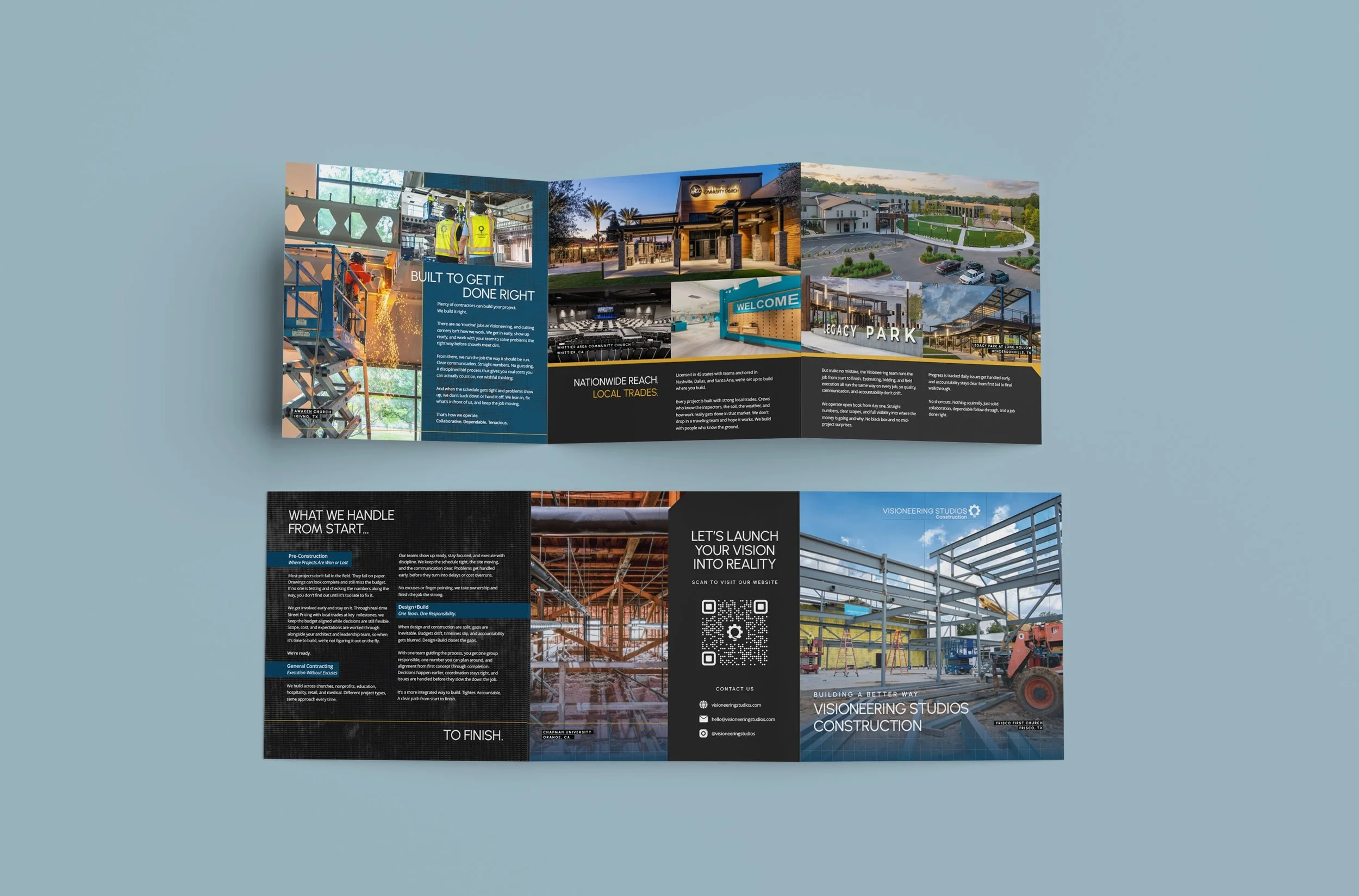
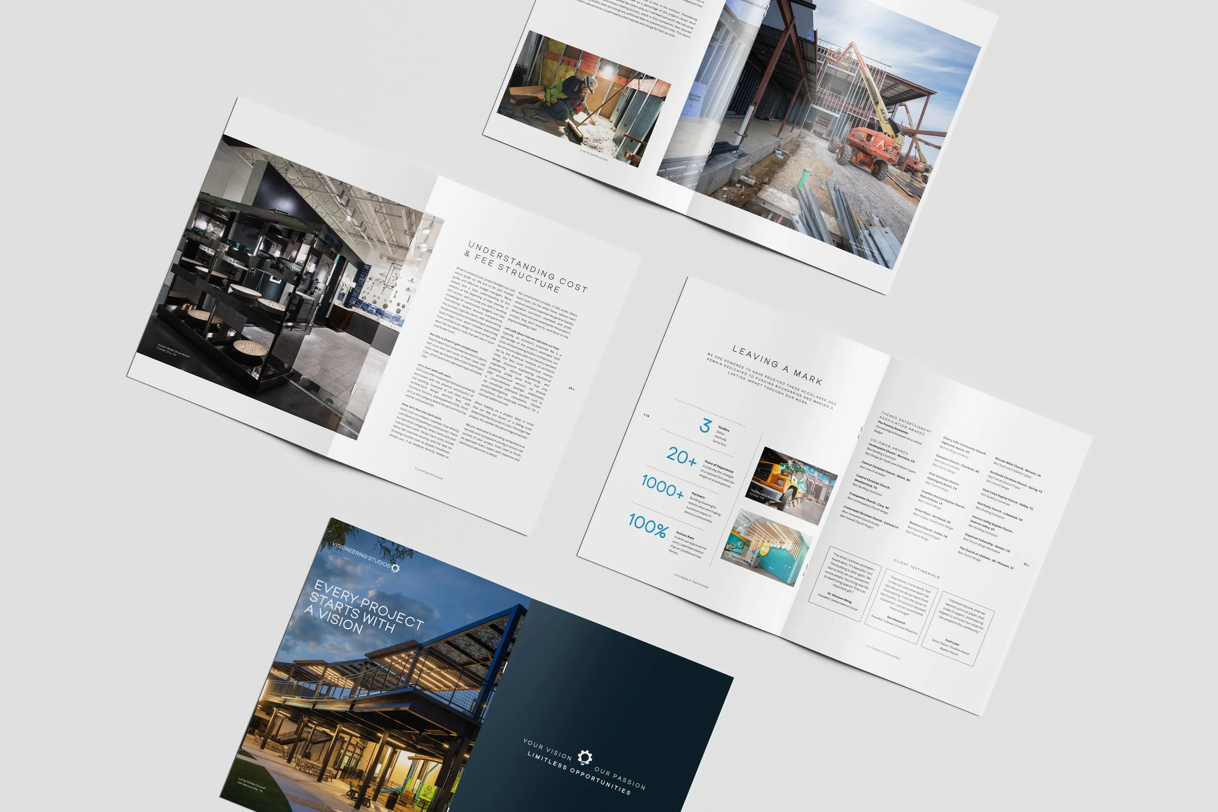
Construction Brochure
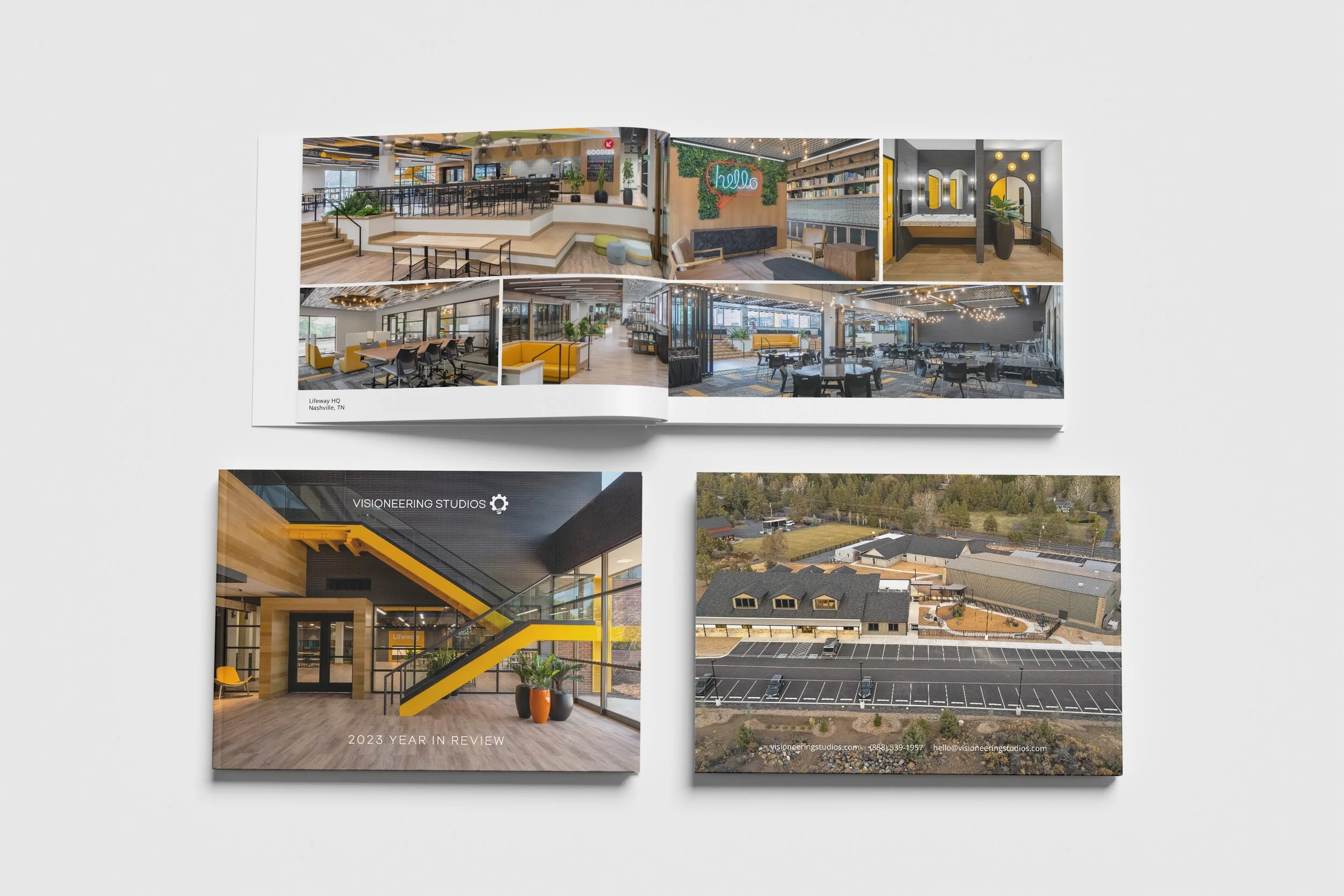
Year In Review
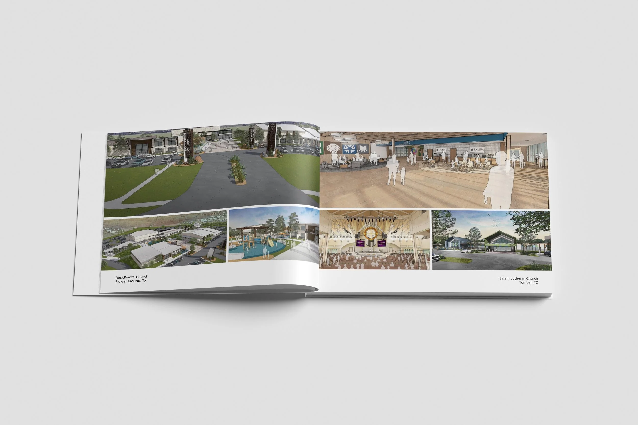
Year In Review
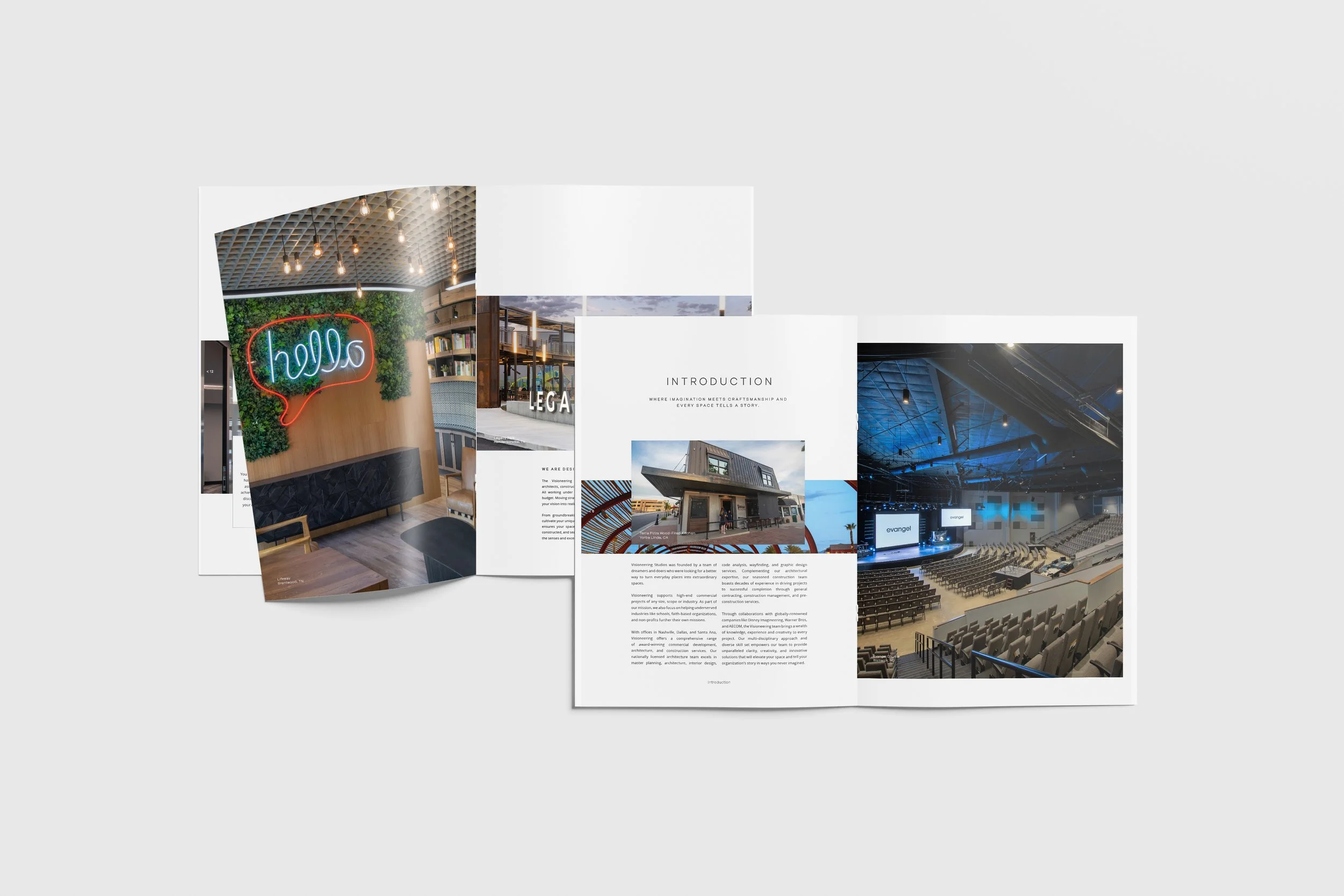
Company Portfolio
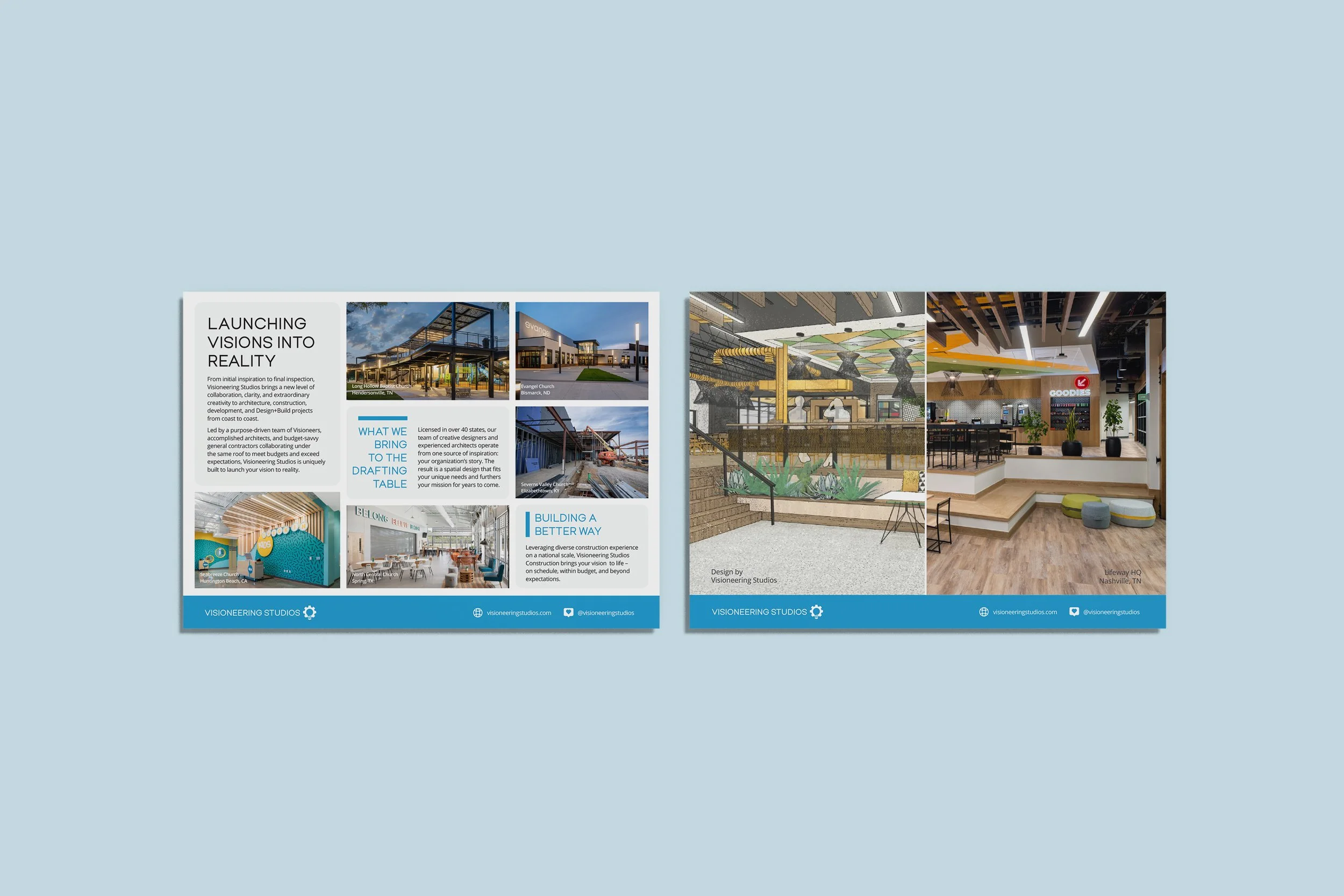
Info Card
Visioneering Studios Website Design
As Visioneering continued to grow, our website no longer reflected the quality of our work, our capabilities, or who we had become as a company. We needed a digital experience that felt as polished and intentional as the spaces we design and build.
I led the redesign from start to finish, creating wireframes in Adobe XD, designing page layouts and custom website components, sourcing imagery, and collaborating directly with developers throughout implementation. Starting with a foundational template, I built a cohesive visual system that improved the user experience while showcasing our projects, services, and brand more effectively.
The result was a cleaner, more modern website that better communicates Visioneering's Design+Build approach and creates a stronger first impression for prospective clients.
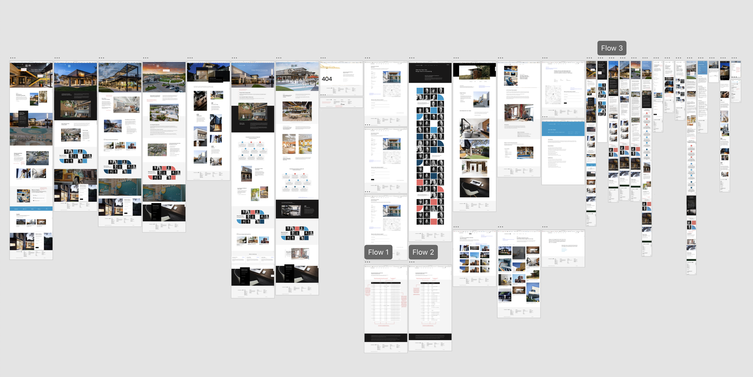
Website Wireframe
Key Improvements.
One of the biggest opportunities I identified was creating a stronger visual connection between visitors and our work. The redesign introduced a more intentional balance of imagery, content, and white space, making it easier to navigate the site and understand Visioneering’s capabilities at a glance. The comparisons below highlight a couple of key pages before and after the redesign.
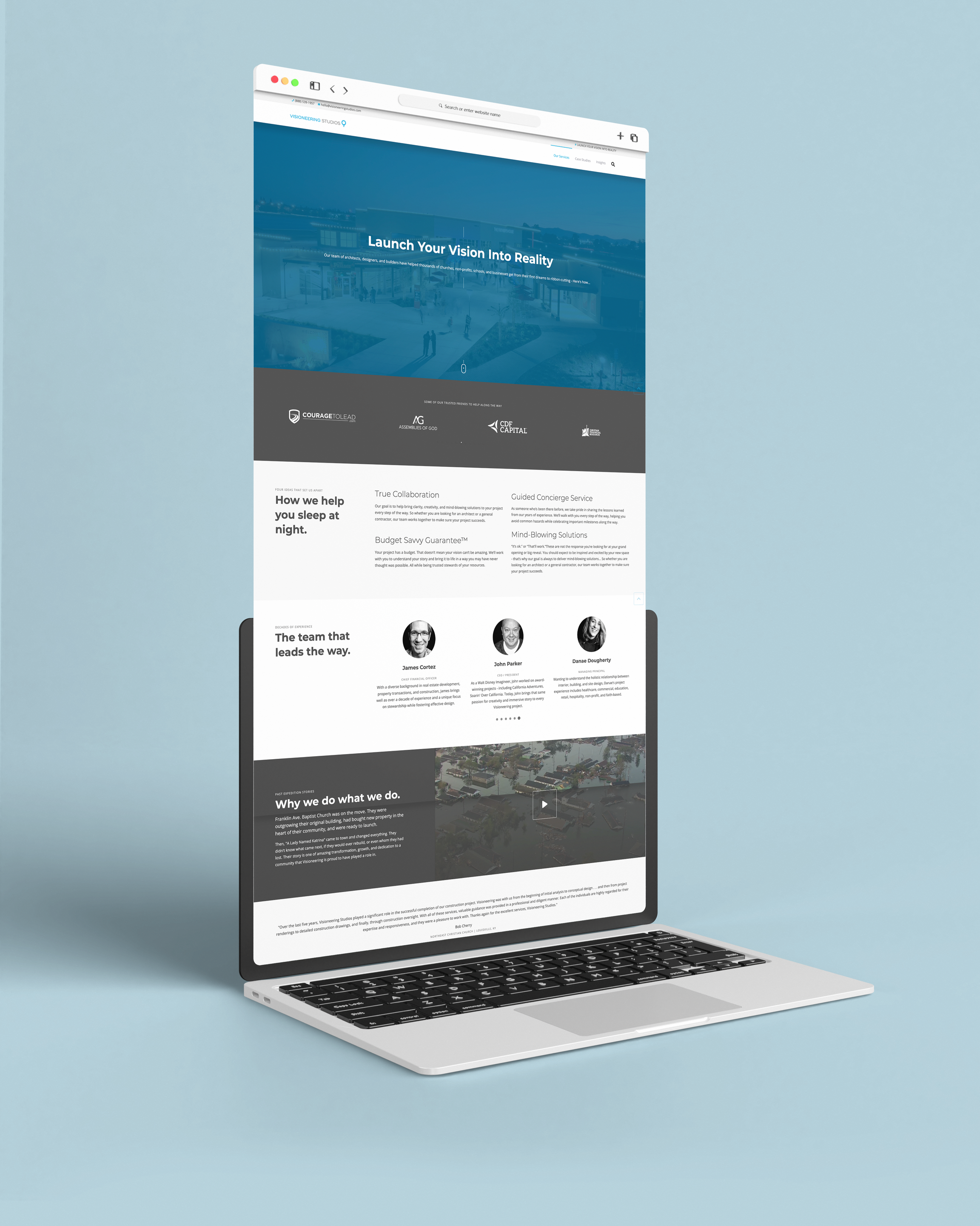
Home Page Before
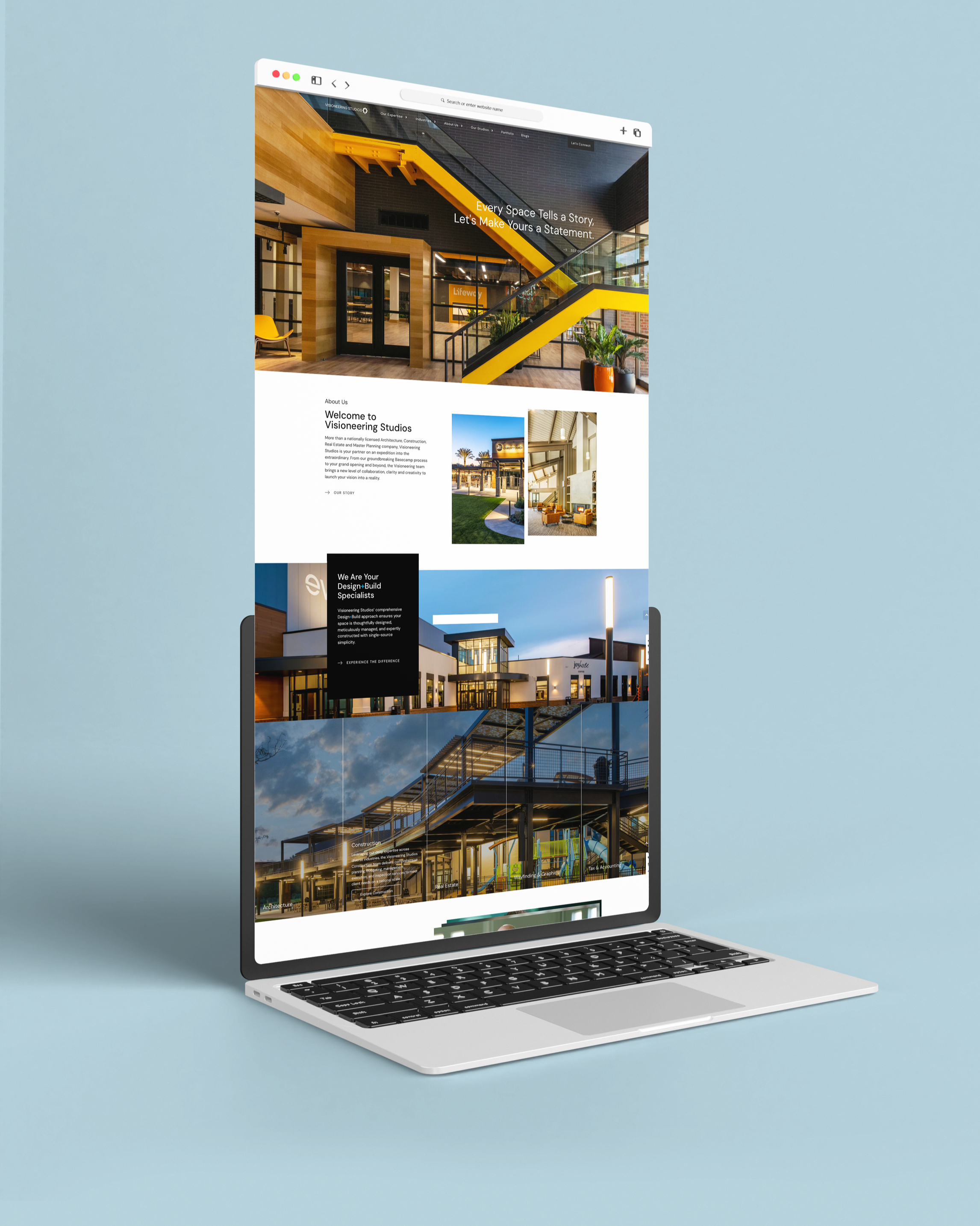
Home Page After
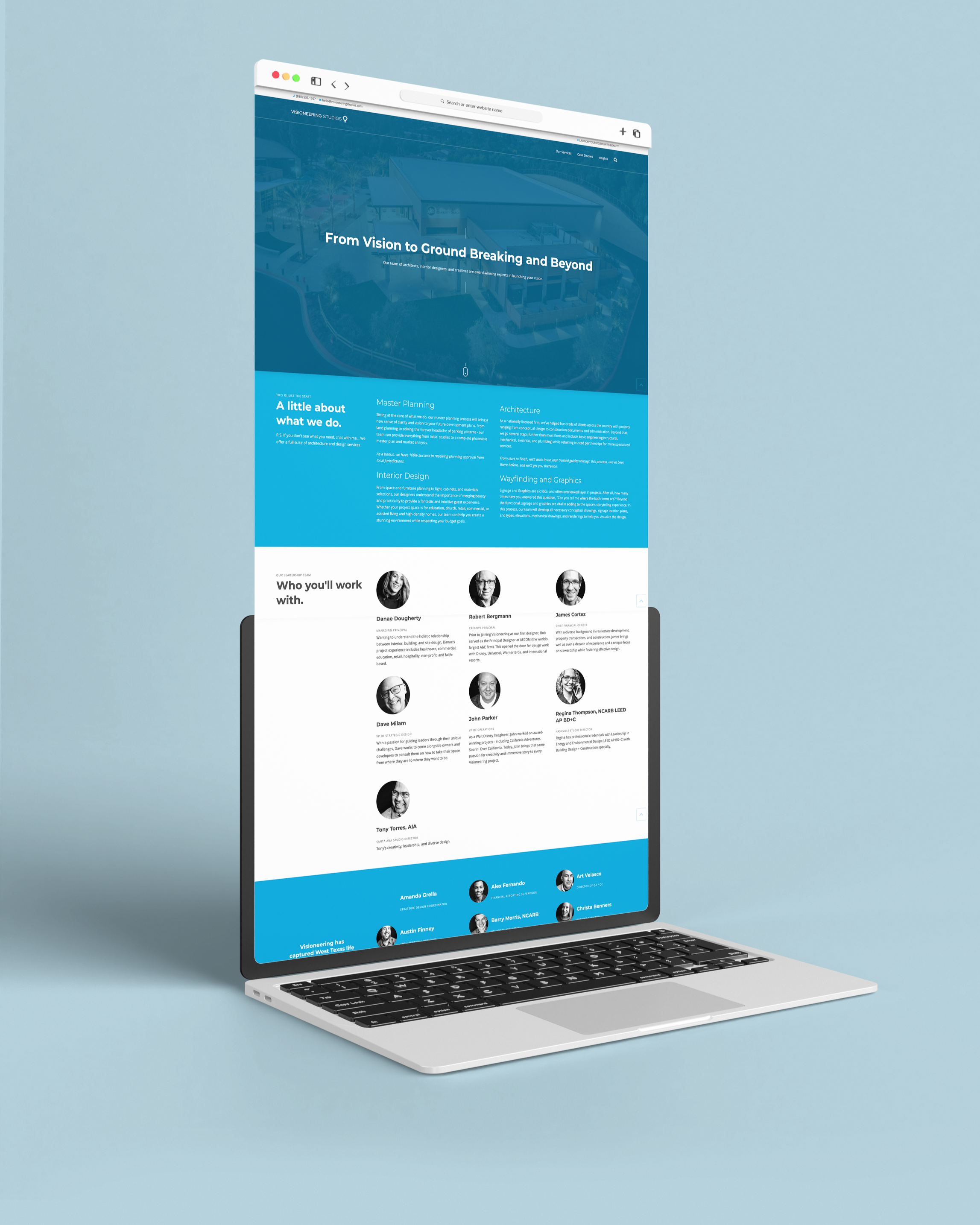
Architecture Page Before
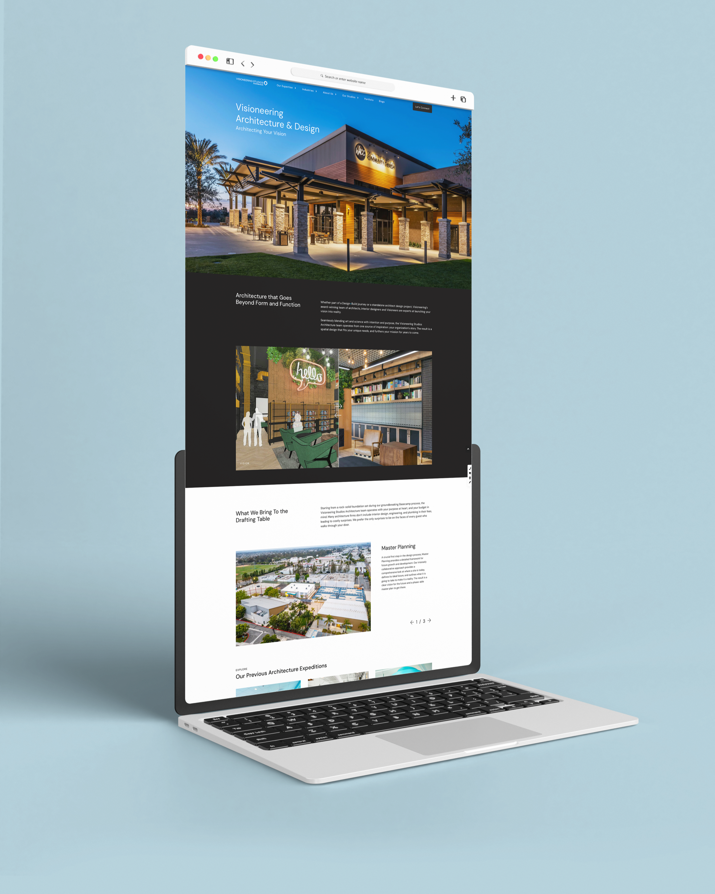
Architecture Page After
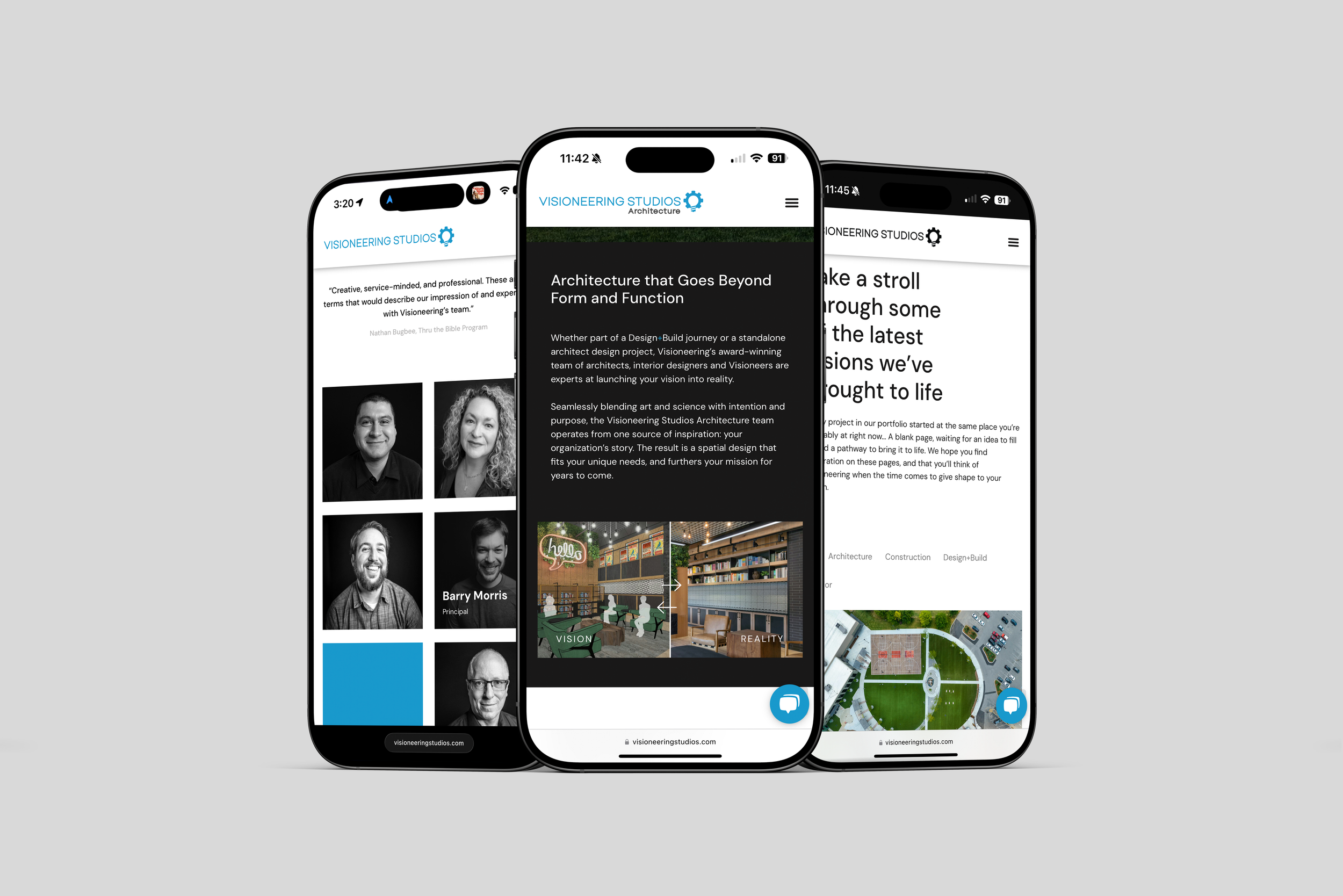
Mobile Website
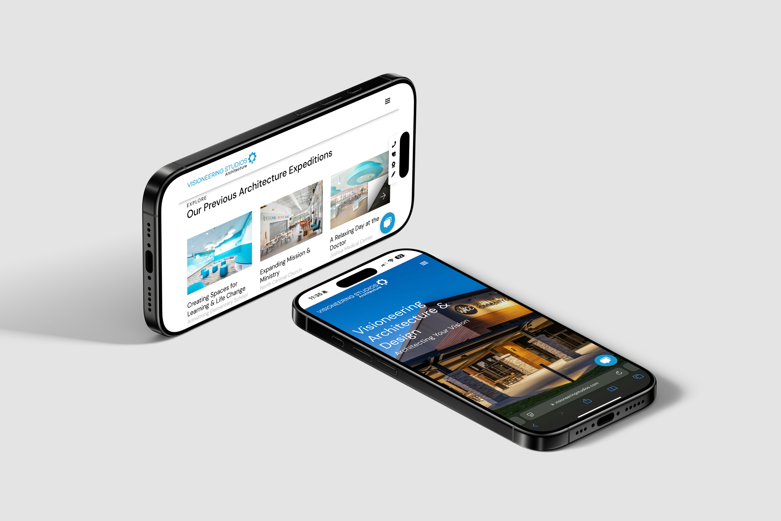
Mobile Website
Creating a Unified Trade Show Experience
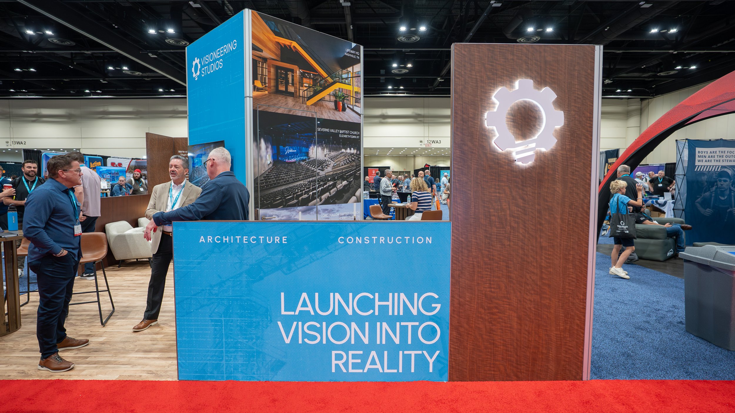
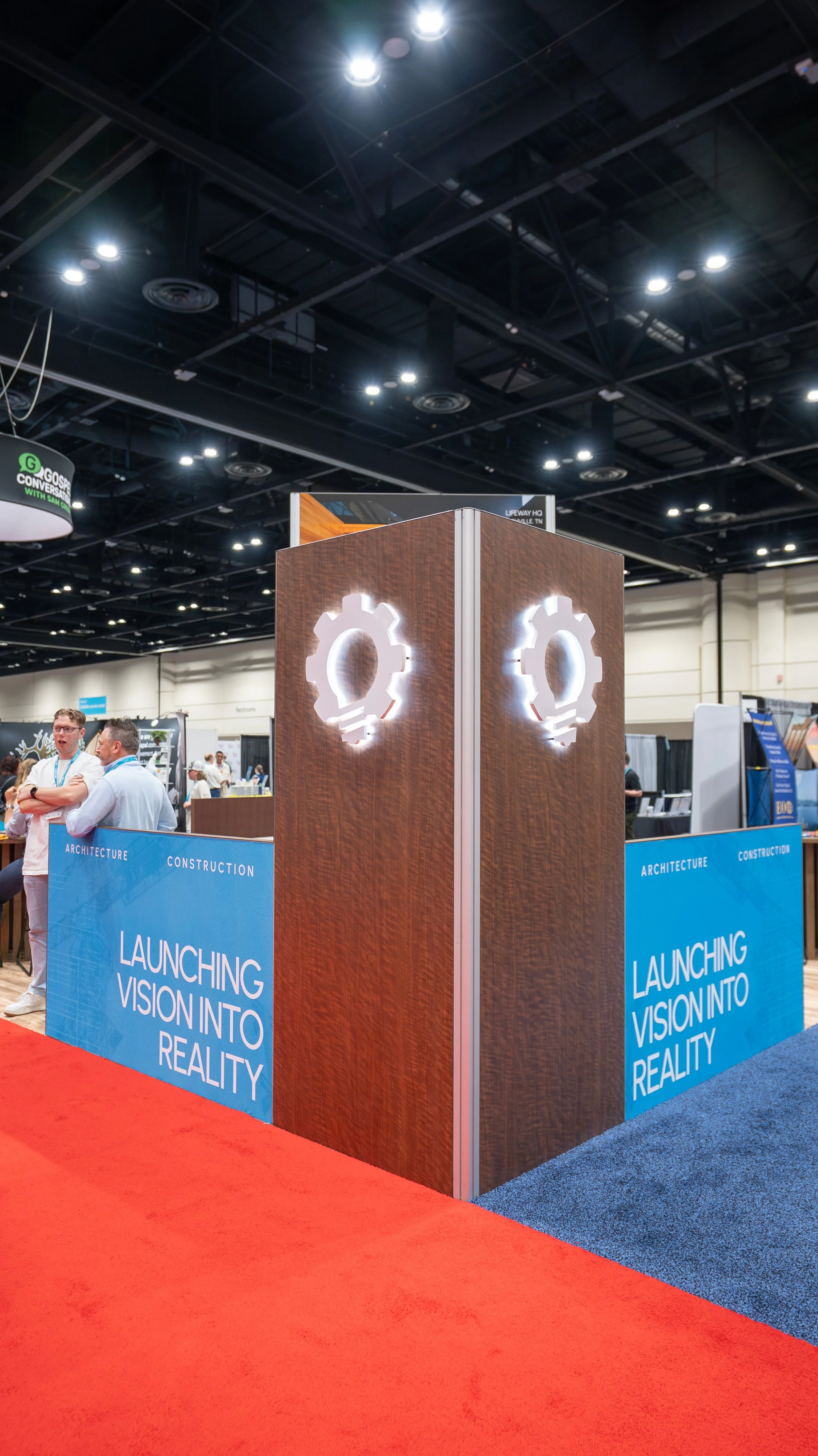
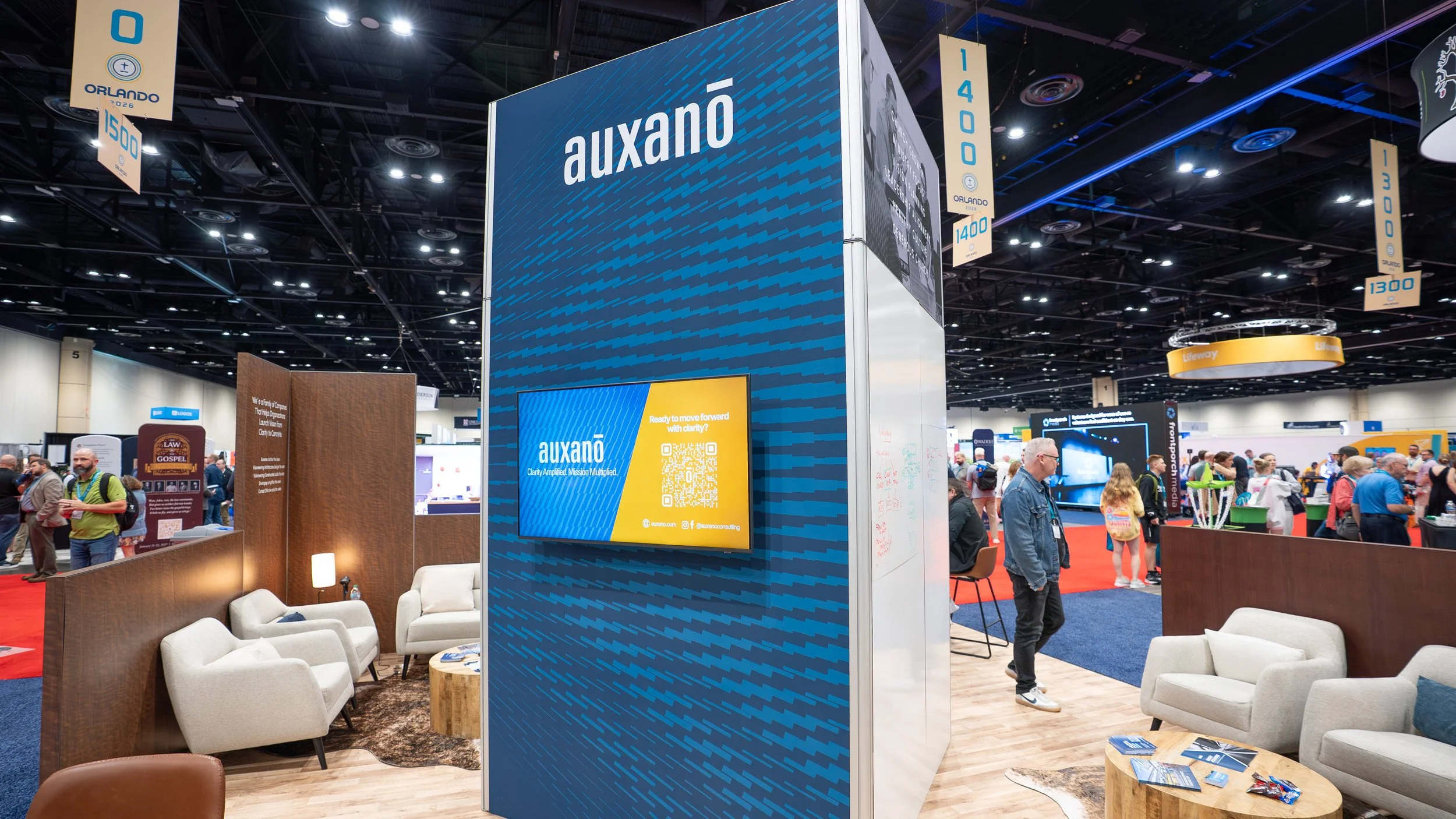
Each year, Visioneering Studios participates in numerous conferences and trade shows, requiring the development of booth graphics, marketing collateral, presentations, signage, promotional materials, and supporting campaign assets. As the lead designer for these events, I am responsible for creating a cohesive visual presence that accurately represents our brands while attracting and engaging attendees.
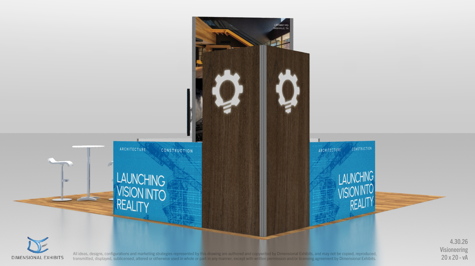
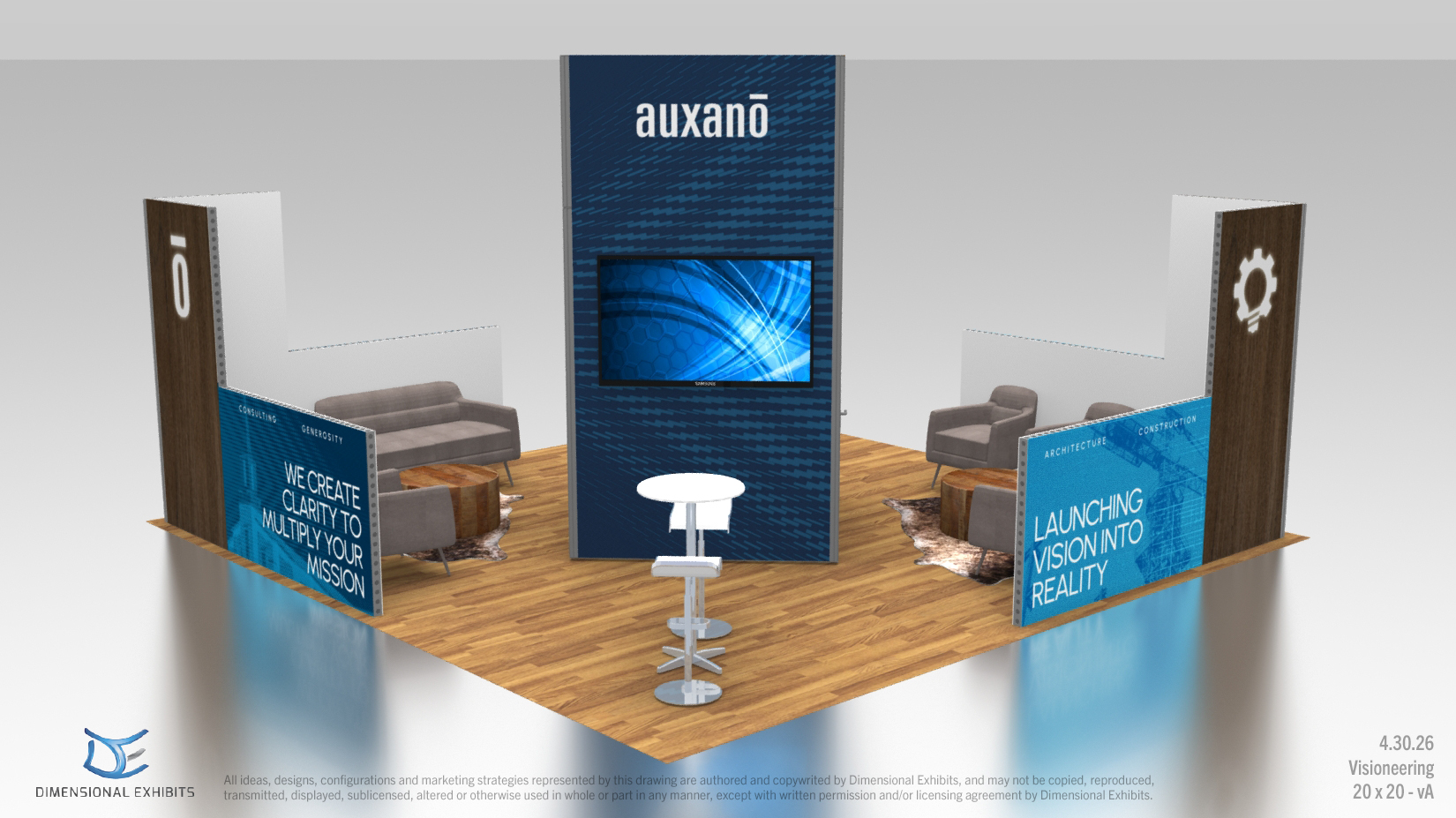
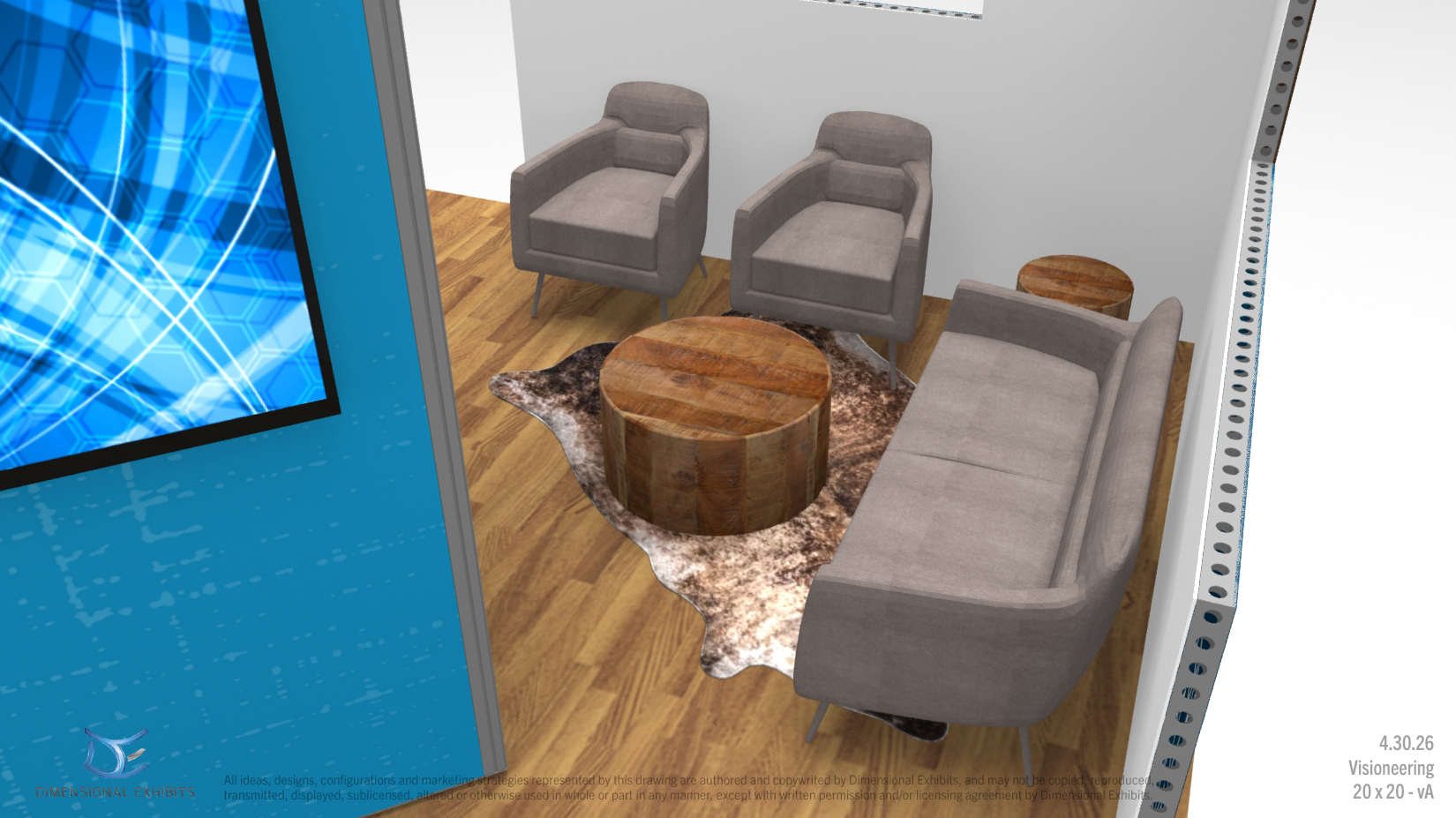
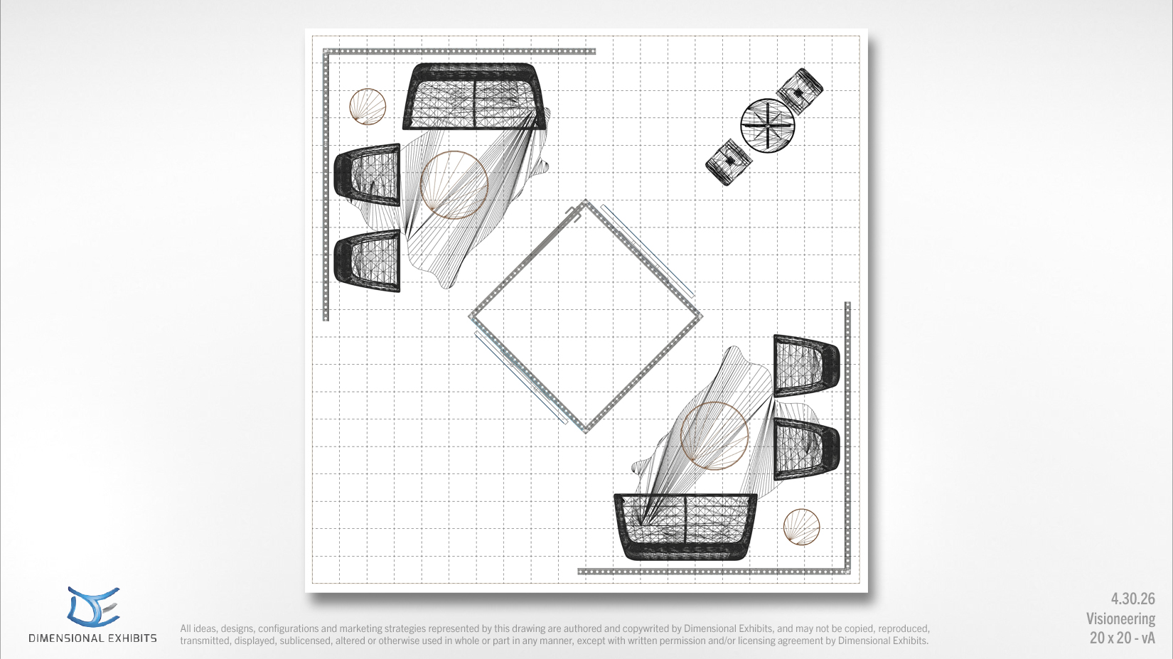
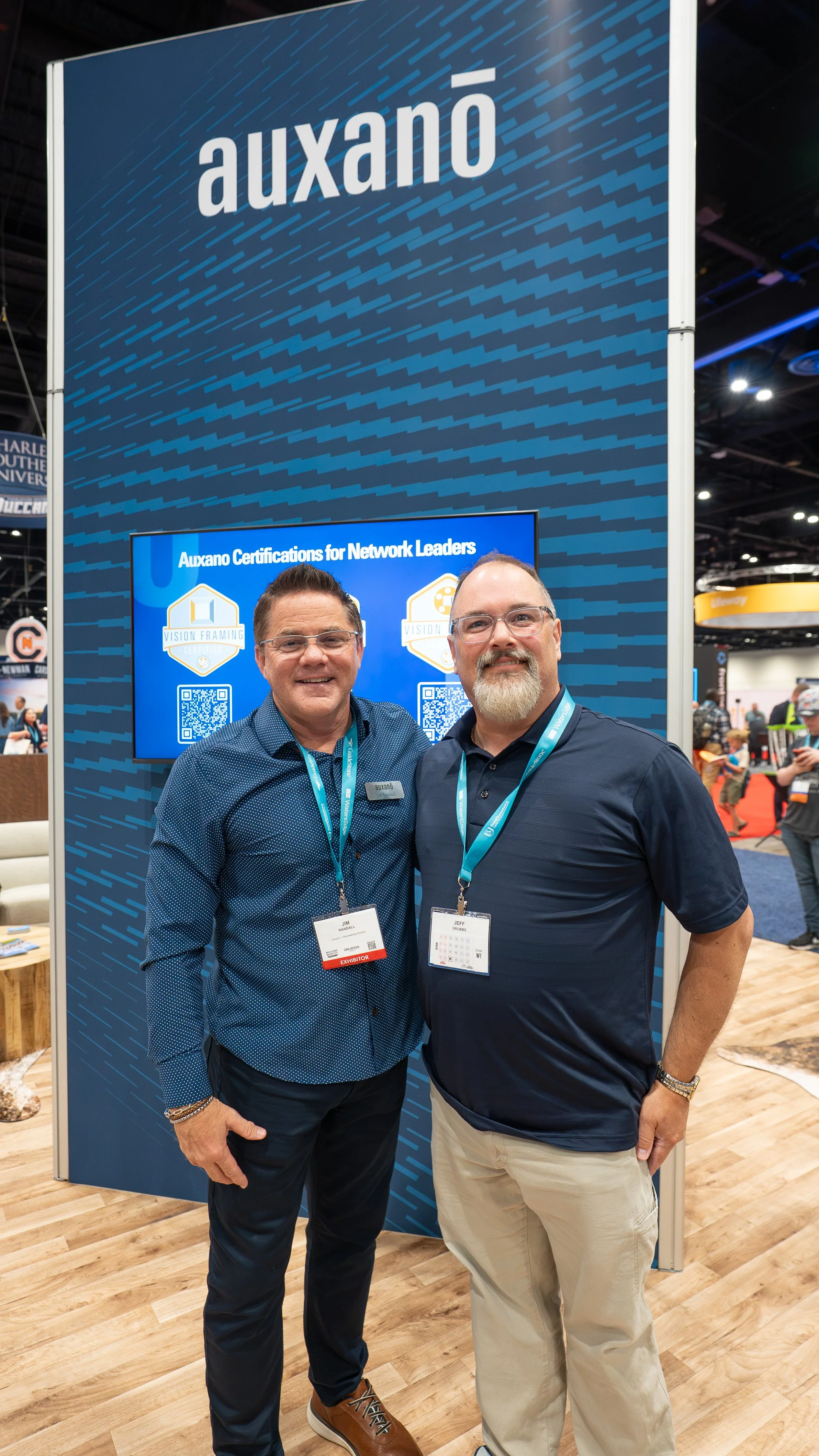
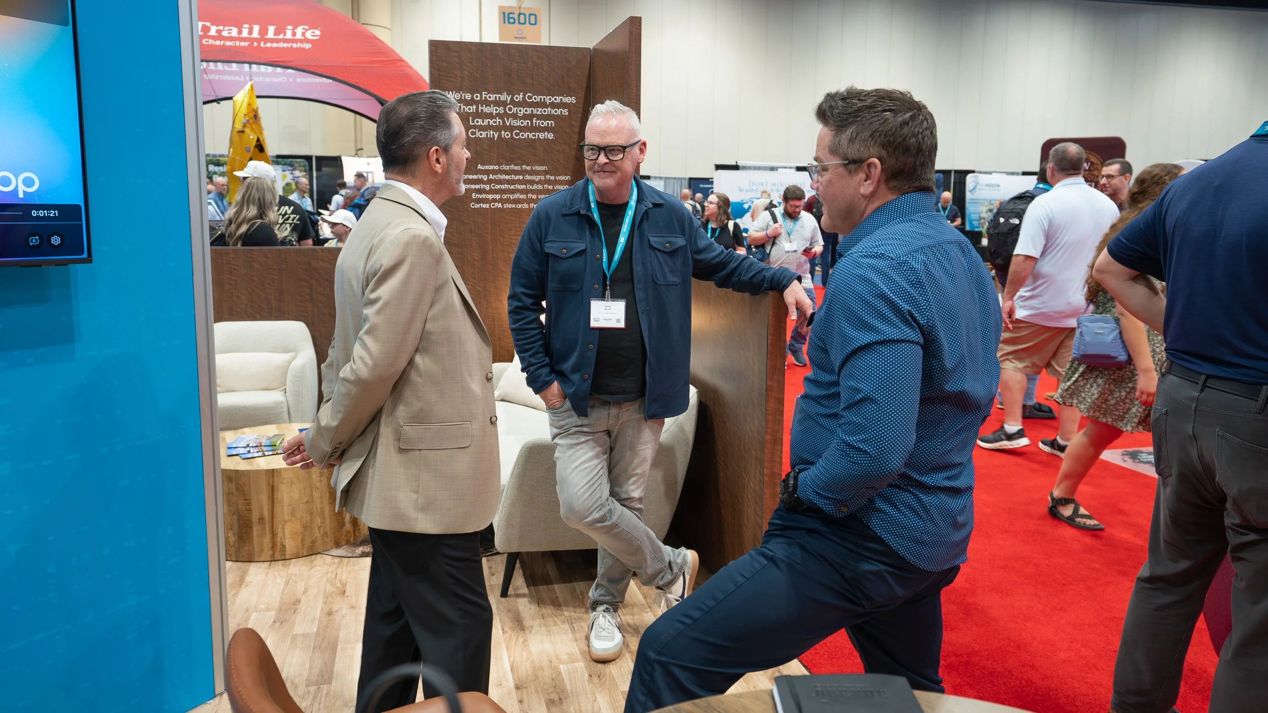
One of our largest events is the Southern Baptist Convention (SBC), where we exhibited in a 20' x 20' booth shortly after Visioneering acquired Auxano. This created a unique branding challenge: introducing Auxano as part of the Visioneering family while preserving the identity and equity of both brands. I developed a co-branded booth experience that balanced consistency and distinction, creating a unified visual system that allowed each company to maintain its own voice while clearly communicating their relationship. The result was a cohesive trade show presence that showcased the combined strengths of both organizations without compromising either brand.
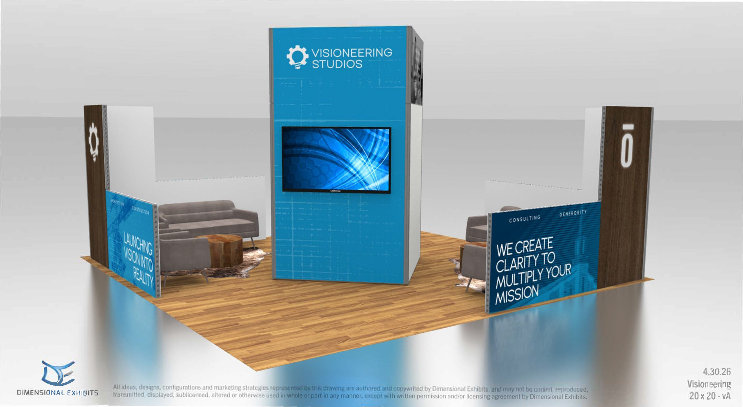
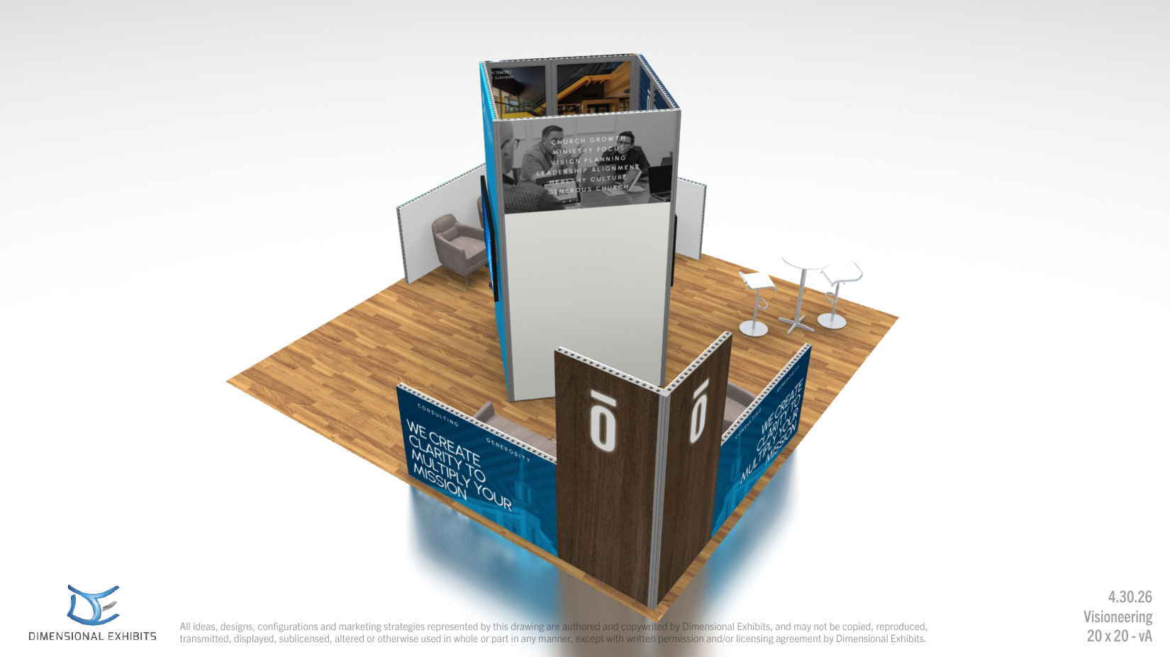
Basecamp Book Deliverable
One of Visioneering Studios’ most comprehensive client deliverables is the Basecamp Book—a comprehensive book that captures weeks of discovery, workshops, and site analysis to present recommendations and solutions for a client’s site.
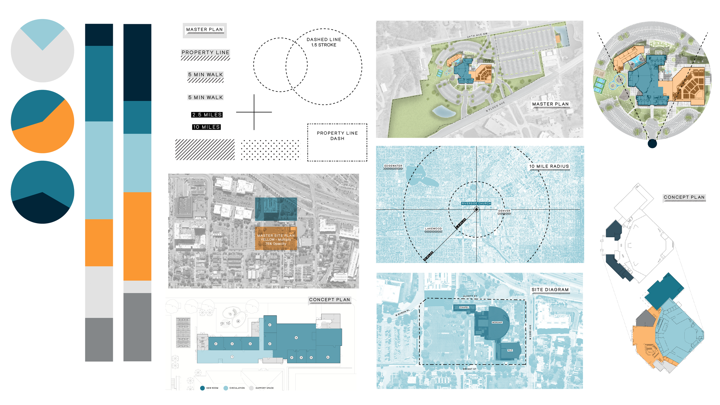
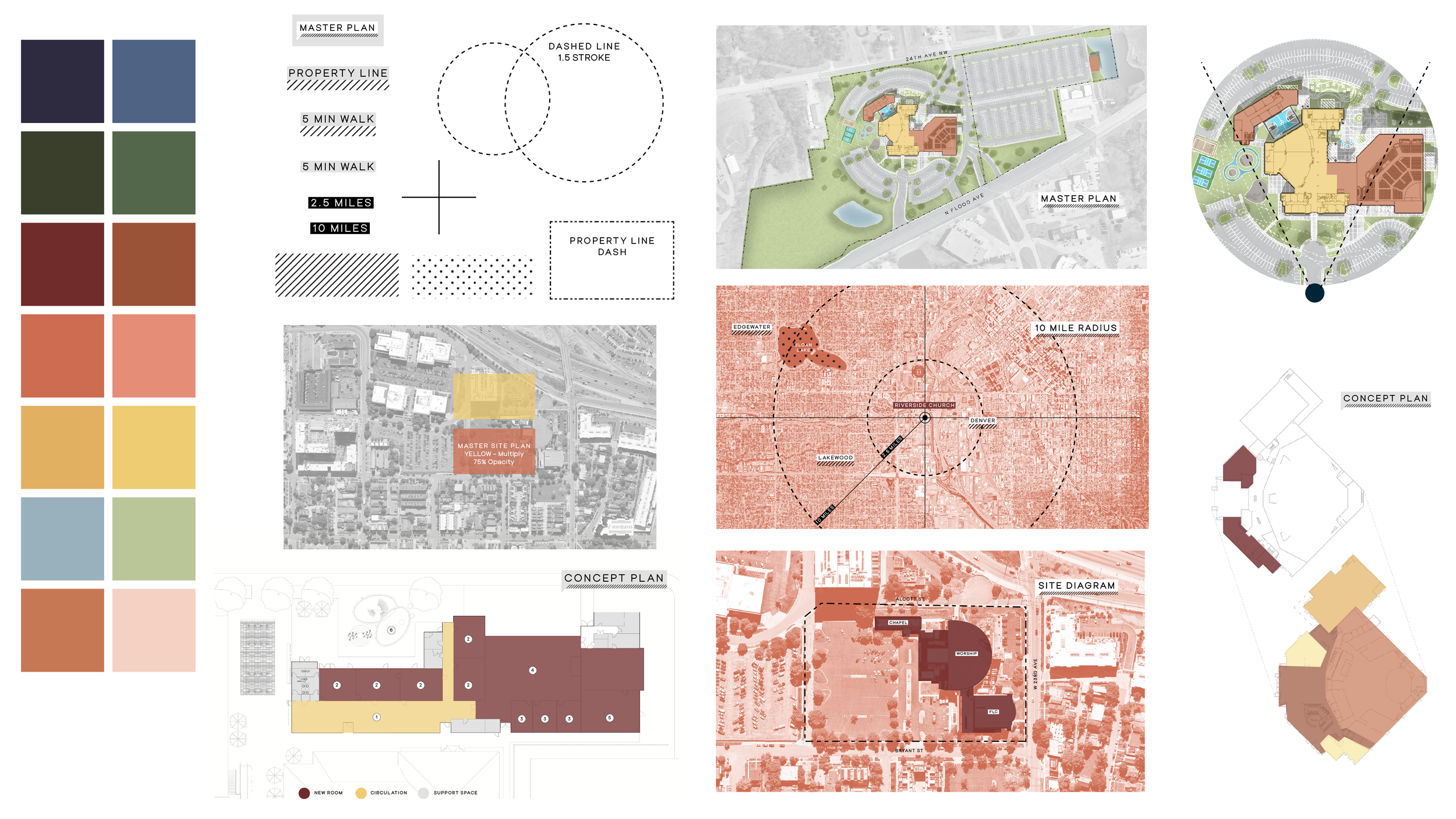
I was tasked with leading a complete redesign of the Basecamp Book. The existing version lacked the level of refinement and clarity expected from a design firm, so my goal was to elevate it into a polished, professional publication that reflected the quality of our work. I began by researching industry best practices and drawing inspiration from architectural publications, planning documents, and environmental graphics systems. From there, I developed a visual language that included color systems, diagram styles, key labels, patterns, and information hierarchy to improve both usability and visual consistency.
The examples below showcase my early explorations of color applications, labeling systems, and graphic treatments using sample diagrams created by our planning team.
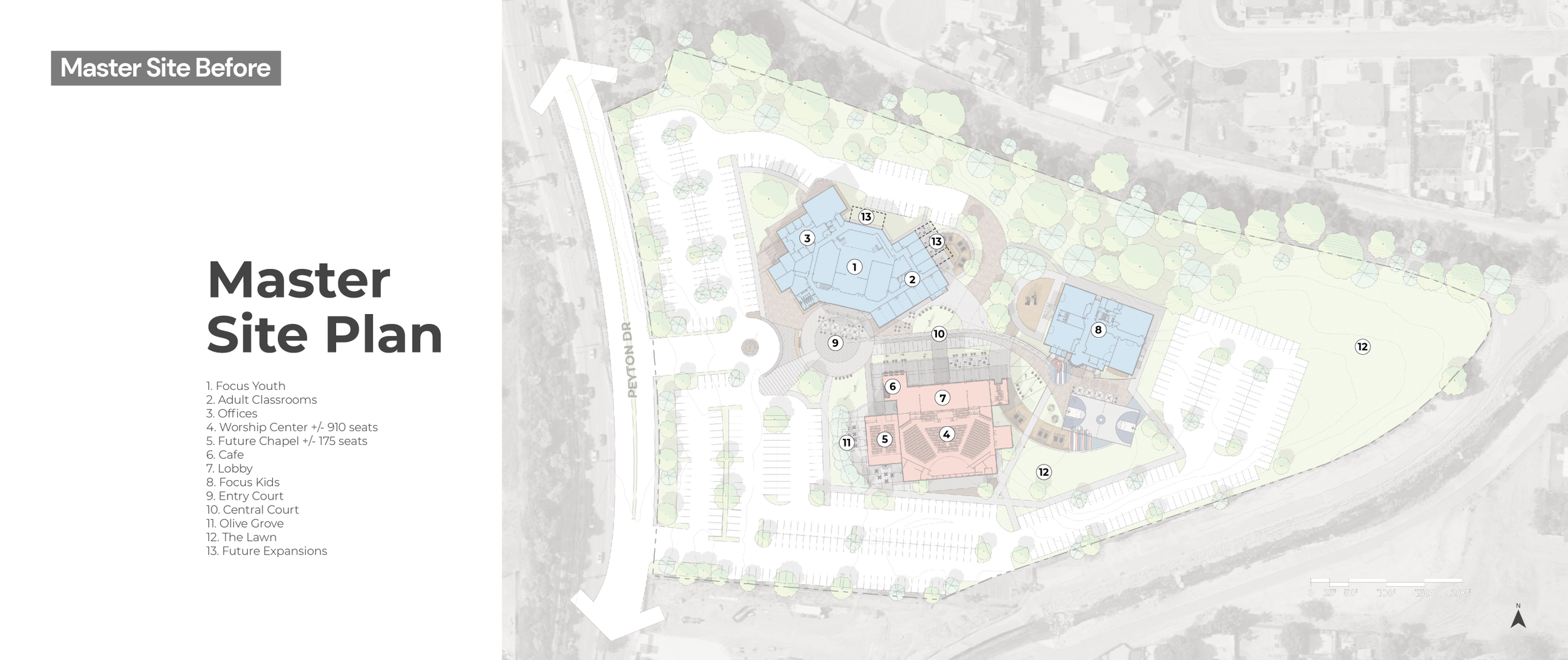
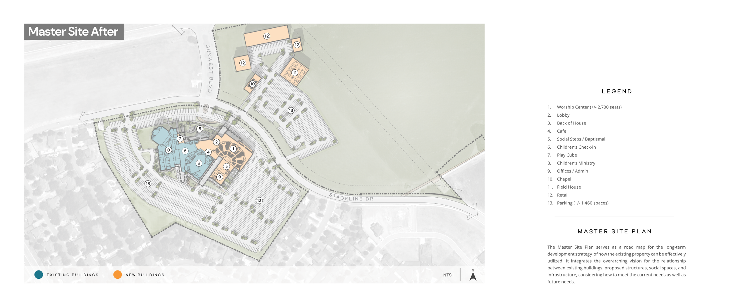
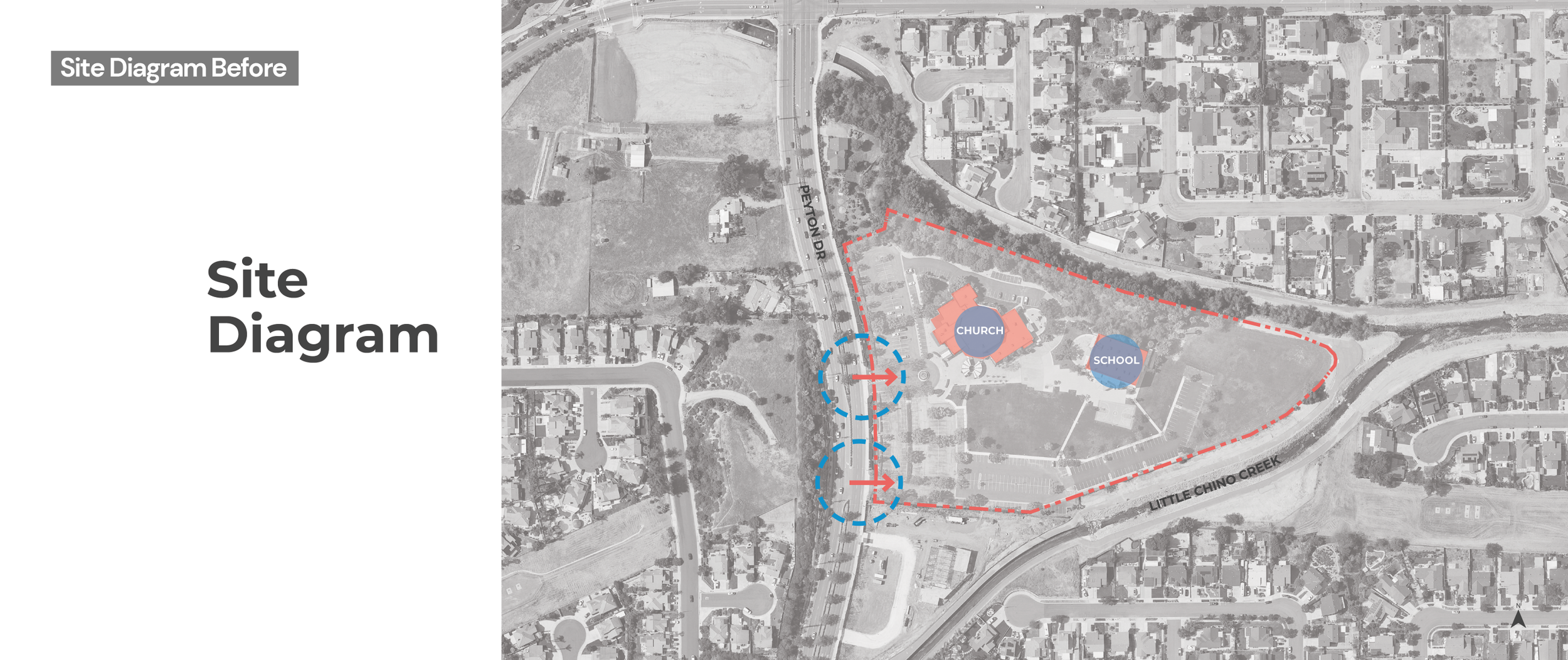
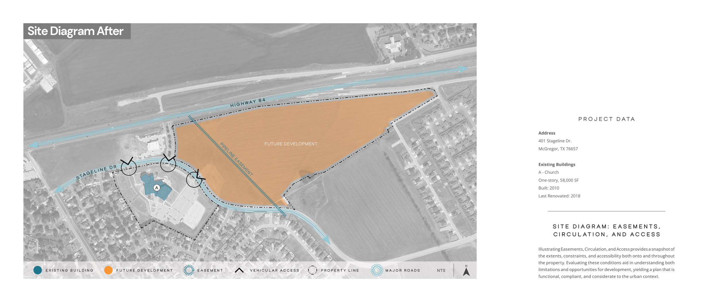
Explore the Redesign Before & Afters.
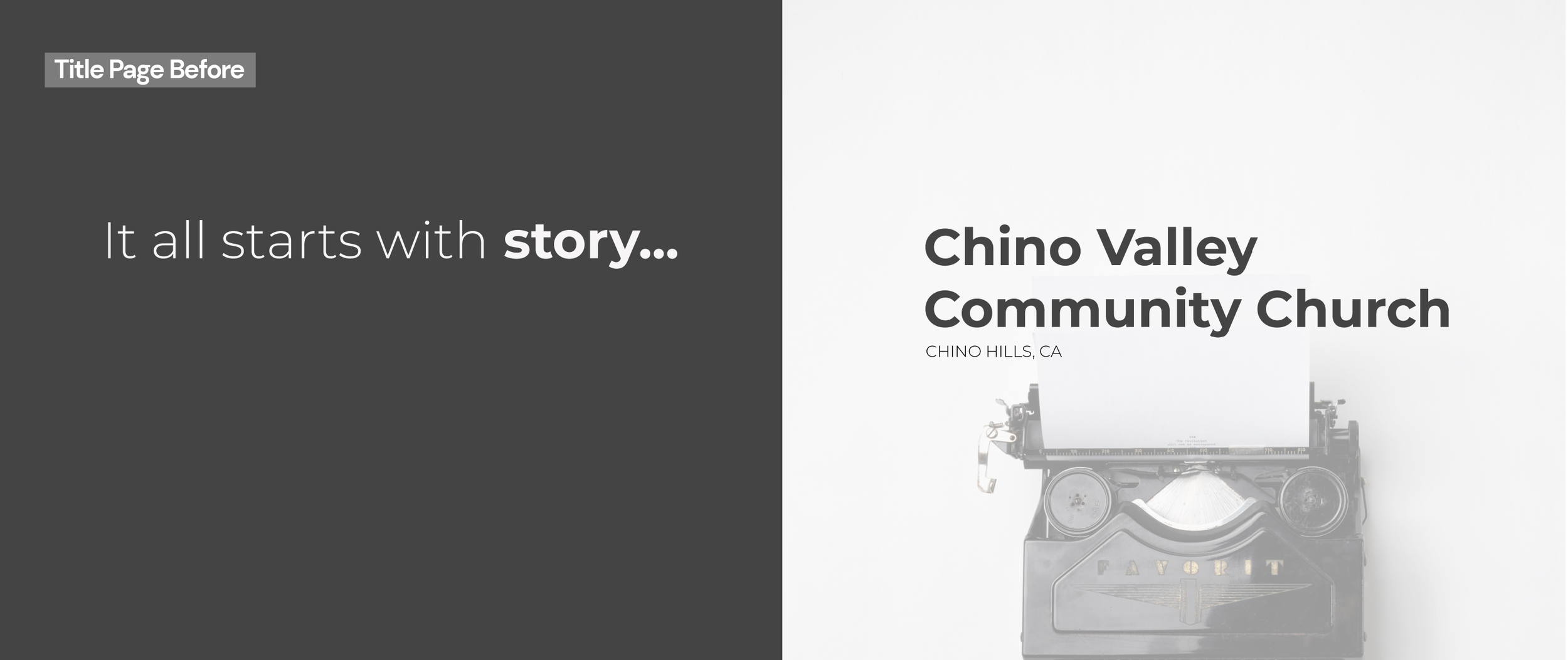
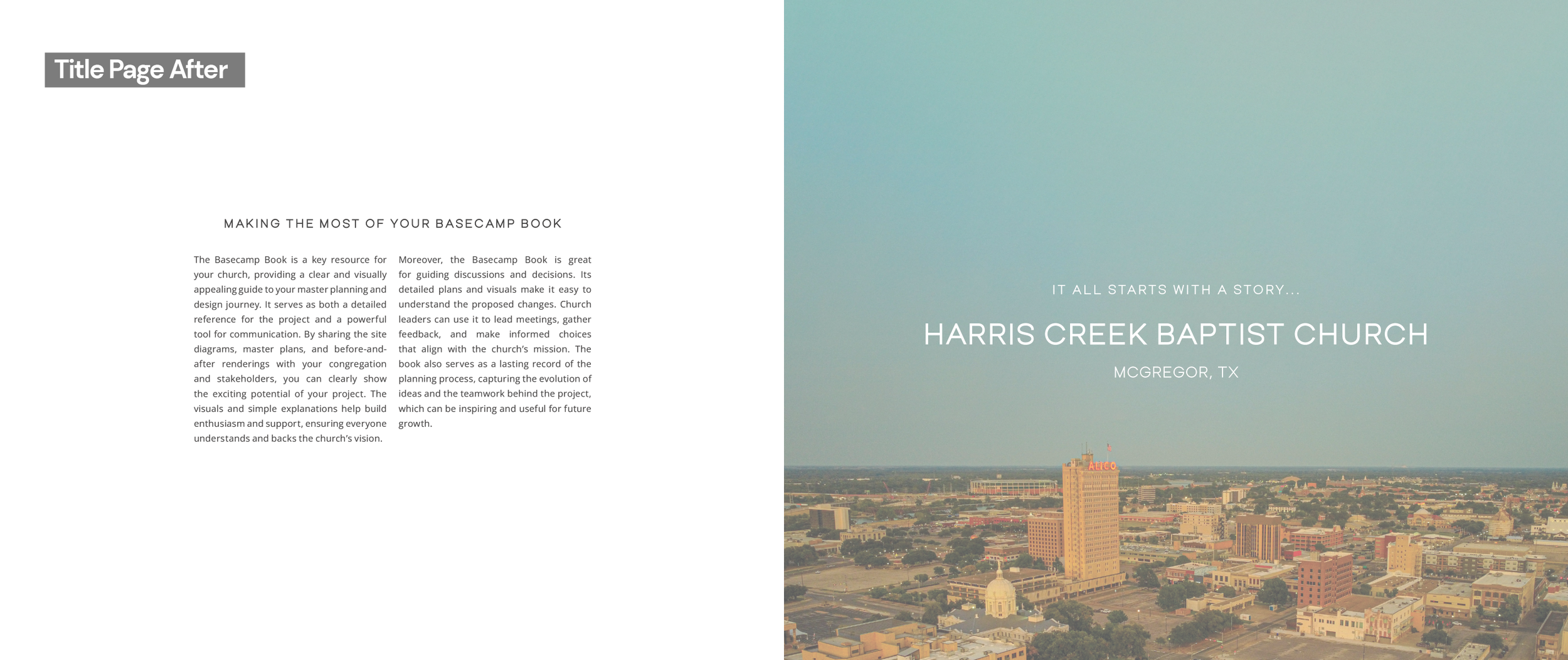
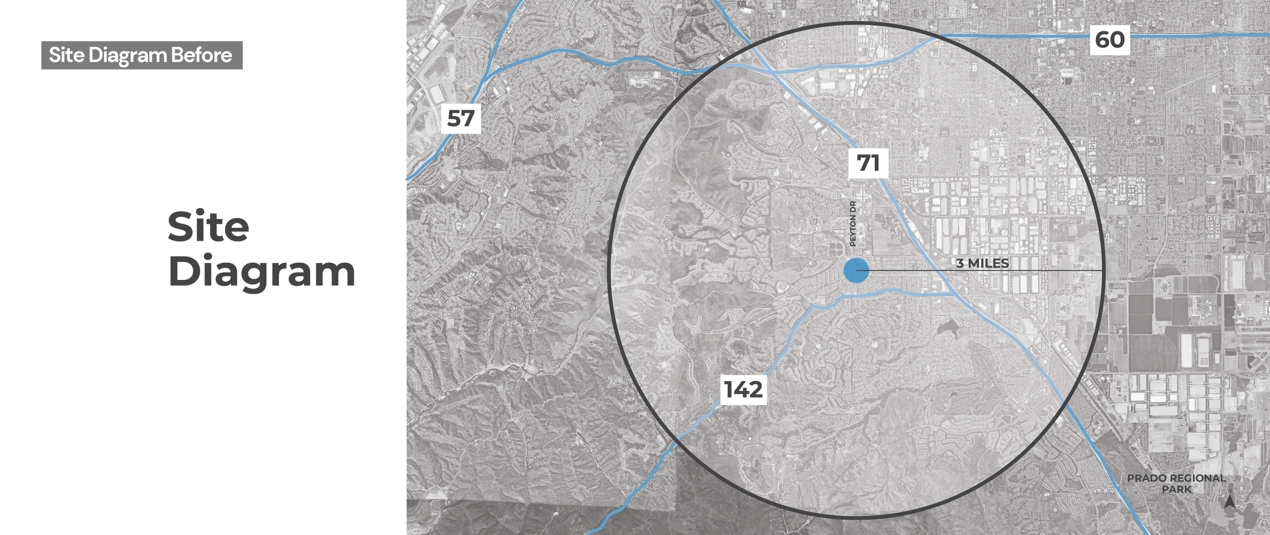
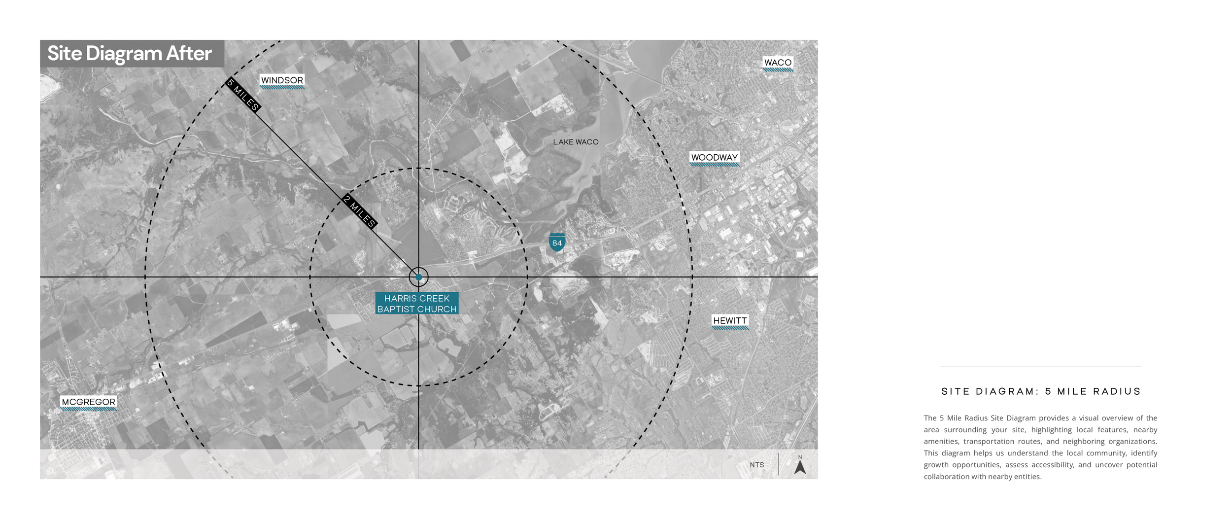
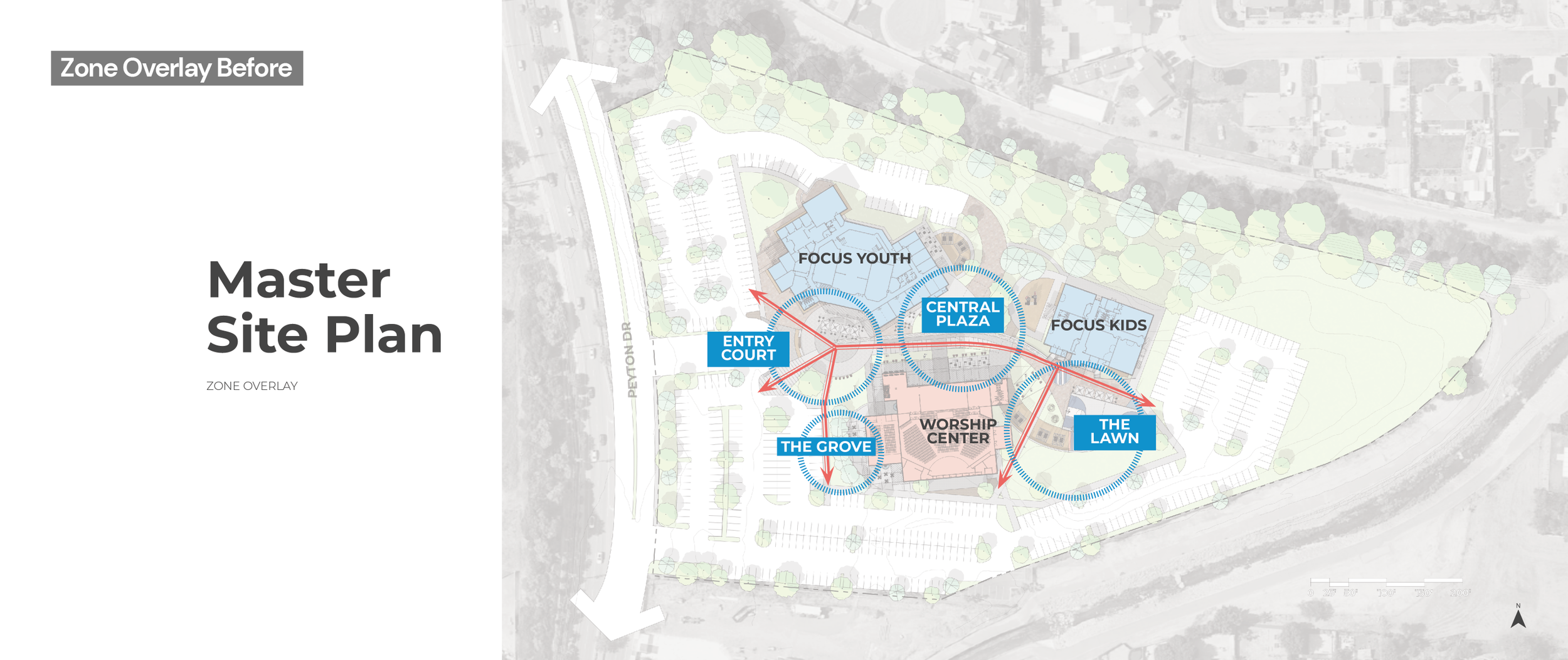
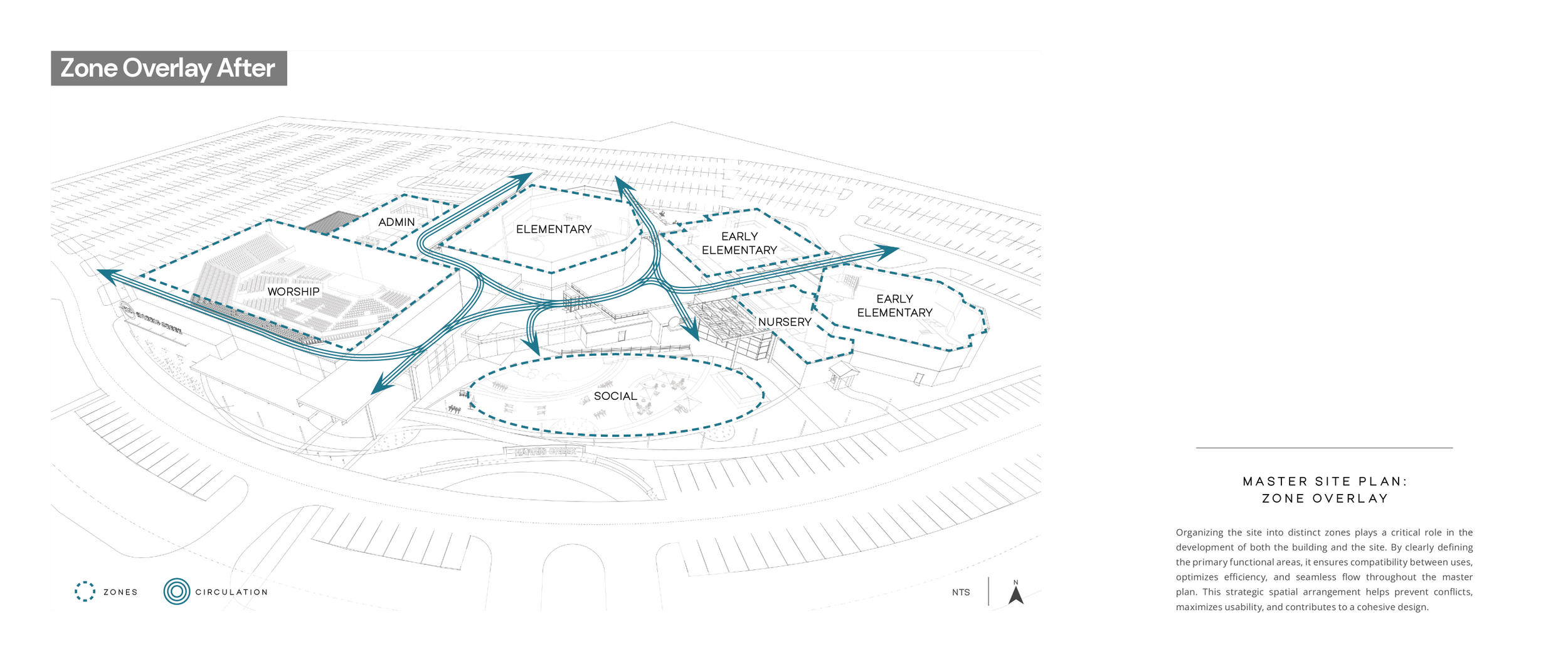
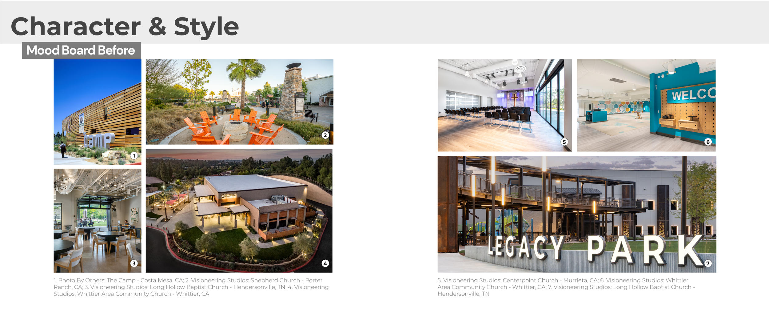
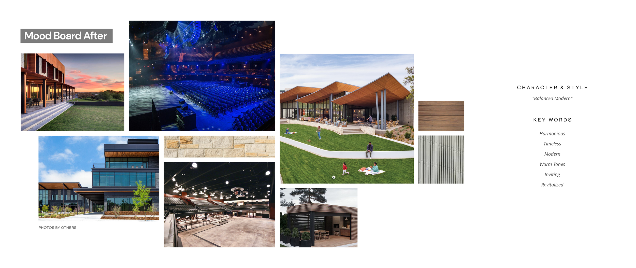
The following spreads showcase the transformation from the previous Basecamp Book to the redesigned system. As someone approaching the content from outside the planning process, I was able to identify areas where clients might struggle to interpret architectural diagrams and planning graphics. This led to the introduction of clearer labeling, diagram explanations, and a stronger information hierarchy to help communicate ideas more effectively.
I developed the visual system and worked closely with one of our architectural designers as it was implemented into planning diagrams and InDesign templates, helping establish a more consistent and user-friendly framework for future Basecamp Books.